Cristina Rubinetterie
There are many important moments in the history of an industry: the entry into the company of the new generation, an acquisition, a corporate change, the construction of a new production site. Changes involving every aspect of the activity, from production to marketing and internal organisation.
Among these steps, the change of the logo is perhaps the most immediately visible, perceptible by all at first sight. The logo, with its shapes, colors, symbols, is the identity card of each brand. It encloses the original idea of the founder, the birth of the company, its values of reference; it tells the story of the company, identifying its mission, its entrepreneurial vision. Present on business cards, catalogues, letterheads, on every company document, as well as on work clothes, on product packaging, the logo is the intermediary, the messenger, the visibility. Often, the graphic sign transcends the very idea of a product, it becomes a mood, an icon. The CRISTINA Rubinetterie logo has been, in recent years, a yellow square with the founder's surname inside. And it has accompanied many stages of the company's evolution in this form.
Today, CRISTINA Rubinetterie presents its new identity card, the result of artistic and creative work that has involved the company on several levels and where, from the very first look, you can see the important news, which outline an even more uniform identity structure.
The square, symbol of stability, geometric shape that Plato considered "absolutely beautiful in itself", made even stronger by the presence of right angles and no longer rounded, assumes almost a life of its own, it breaks away from the company's signature. Yellow, the most expansive of colours, the most difficult shade to turn off, remains, in a warmer shade, inside the square. The four sides of the square continue to geometrically fix the keystones of the company's philosophy: experience, passion for work, technological research and a taste for beauty. A new lettering characterizes the name of the company, with a well-defined initial C; the product category with which the company operates makes its entrance: CRISTINA Rubinetterie.
Black remains the colour that fixes the company name in the logo, confirming the association with yellow as its natural complementary colour. In this new graphic context, the reference to yin and yang, to the dualism between masculine elements such as the square, and feminine elements such as yellow and Cristina, expresses a role of stability, a declaration of intent that highlights the industrial character of the brand. The new imprint wants to underline the strong will of CRISTINA Rubinetterie to be immediately recognizable as one of the reference players in its sector. A leading actor, in Italy and in the sixty countries where the company is present with its collections of high thickness and strong aesthetic characterization.
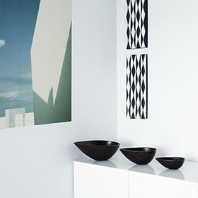
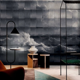
A new stand, architecturally reformulated according to the needs perceived by CRISTINA Rubinetterie as more suitable for the positioning of the brand. A space that, in the new volumes and in the use of evocative lighting elements, will give more prominence to the products presented inside, offering at the same time an overall view of the thermal and wellness atmospheres. Atmospheres where water is the protagonist, the source of the story of a company strongly anchored to its principles, to its mission, to a DNA that sees in the Made in Italy the core of the production activity.
© Fuorisalone.it — All rights reserved.
© Fuorisalone.it — All rights reserved.